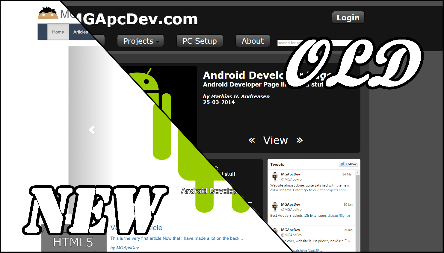
Finally the new website is up at running, some features might not be up jet, but progress has been made and numerous improvements have been implemented.

As for improvements the website not only displays a sense of competence, but carefull consideration for color schemes and new web standarts.
As for actual differences I've firstly switched from my own CMS system to Joomla (whether that was the right decision is questionable).
There is also now responsive design across the entire site, being designed mobile first. Abviously this would require some good css and as for general elements I've used some Bootstrap for a few elements and SCSS for my own sections.
The color scheme has also been updated, which took longer then expected, since I'm terrible with colors. Although I'm quite satisfied with the result I do have to thank the other creaters for doing the hard work for me (espessialy http://ourlittleprojects.com/).
Starting from scrath again did also improve the general structure of the site, now making it more of a portfolio rather than just a fun project.